Could AI that hallucinates actually be the most powerful tool in your arsenal?
⇒ What if the key to unlocking AI’s full potential isn’t making it faster or smarter, but making it bite-sized, delicious and satisfying?
If you’ve used AI, you know it isn’t a magical, foolproof solution. It’s a powerful engine, but it’s useless unless great user experience (UX) is there to provide the direction. We’ve moved from the frustrating, manual, command-and-control era of software to an exhilarating—and sometimes terrifying—AI-powered ride. But even with UX as our guide, a new challenge has emerged: the Attention Economy.
- Today’s users are focus-starved and constantly interrupted by distractions, from work notifications to social media. Designing for a utopian user who sits down and focuses on a single, long-winded process is a trap that leads to failure.
- Now, imagine that utopian trap applied to the endless output of AI. Without a guiding hand, AI generates a firehose of information—a raw flood of text, images, and data that mirrors the worst of utopian design. It’s overwhelming and unsuited for a world where people are mentally and physically disabled by constant distraction.
This is the next frontier of UX for AI: turning the AI firehose into a series of digestible, valuable snacks.
Designing for a Focus-Starved Society
Snackable design accepts the reality of our users’ lives. It’s a pragmatic approach that acknowledges users don’t have endless focus, a perfect internet connection, or a lack of interruptions. This is even more critical when a single AI prompt can produce what would have taken a human weeks to assemble.
The constant threat of interruption is a reality for most users, most of the time. We cannot expect them to consume a massive, unorganized report from AI in a single session.
UX must step in and apply the principles of snackable design to AI’s output, making the smallest ask possible of the user’s attention.
- Chop Down the Copy: AI is verbose by default. Instead of presenting a massive block of text, the UX should automatically summarize it into a few clear sentences or bullet points. This reduces cognitive load and makes the information easy to consume at a glance.
- Make Small Asks: A multi-step process for a user to get the information they need from AI is a fail. An unwieldy AI experience will lead to users bailing before they get any value. The design should break the interaction into small, clear, digestible steps.
- Save Progress: A great snackable design saves a user’s progress. In an AI context, this means the system remembers the user’s intent and context even after an interruption, so they don’t have to start from scratch.

Busy people are
mentally & physically disabled
Snackable Design embraces the busy-ness of life
Regardless of what you are designing or the target market, making your design snackable is the way to overcome the traps of Utopian Design. What is a Snackable Design? In general, snackable designs are much more successful because the task flow is carved into bite-sized parts that are easy on user’s brains, even in distracted environments where connections fail. Snackable design is a framework which accepts that users are focus-starved and allows them to easily accomplish tasks even if constantly interrupted.
UX: The Master Curator
The first wave of AI UX was about creating the steering wheel. The next wave is about creating the curation engine—a system that refines the raw power of AI into an elegant, snackable experience.
AI without snackable design is like giving someone a full-course meal in a single, unorganized platter. It might contain all the right ingredients, but it’s overwhelming and unappealing. UX is the master chef who takes those ingredients and arranges them into a beautifully presented, delicious, and easy-to-enjoy meal.
The future of UX isn’t just about crafting the input; it’s about curating the outputs to be as valuable and digestible as possible. We’re not just designing tools; we’re designing for reality.

Is good “good enough” or do you want “great” results? to great requires user-editable results
Never require users to give AI the perfect prompt. It’s not a mind-reader. AI can get you to 80%. That’s good. For some tasks, good is “good enough”. However, when you want or need “great”, you need that last 20%. Endless re-prompting won’t get the user there. The last 20% is only possible with a user-editable result. Therefore, always frame the UX around AI so that it delivers something the user can directly tweak to perfection.
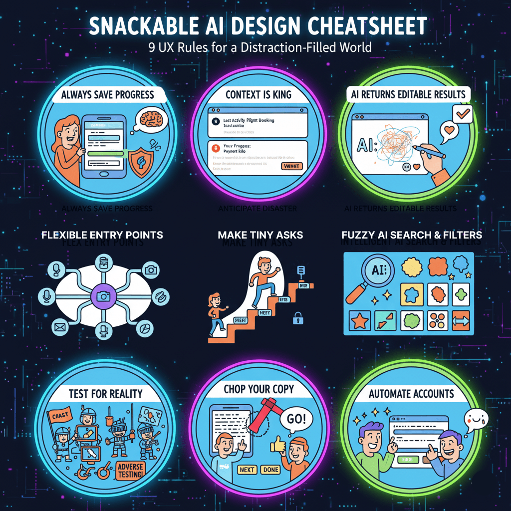
The 9 Rules of AI Snackable Design:
Snackability is smart UX in a distraction-filled world.
- Always Save Progress: Let users effortlessly resume unfinished flows. Anticipate and design for disaster, like mid-flow internet failure or surprisingly slow servers! What if the user has no last name at all?
- Don’t make users remember Context: If a user looks away for a few minutes, hours, or days, can they see a) what they were doing and b) where they were at in that process.
- Always have AI return an editable result: Never require users to give AI the perfect prompt. It’s not a mind-reader. It can get you 80% there. The last 20% is only possible with a user-editable result.
- Flex Your Entry Points: Don’t demand mandatory inputs when users could start with less, or even one.
- Make Tiny Asks: Strip each step to essentials. Low cognitive load feels easy. Group complex steps into sections.
- Intelligent AI Search & Filters: Deliver AI-driven, fuzzy-matched results and lightning-fast client-side filters.
- Chop Your Copy: Design should show, not tell. Use concise verbs for buttons. Lots of text flags complex design.
- Automate Accounts (Post-Action): Never require or ask users to create an account until they’ve done something meaningful. Once users have provided info (e.g., after an order), offer to create an account using what they’ve already entered. Instant magic!
- Test for Reality: Don’t just test usability; test snackability under adverse conditions – distractions, broken connections, real-world chaos. (Adverse testing is a combat sport!)
Your Design’s “Ask”: Is It a First Date or a Marriage Proposal?
You’ve got a “hot new feature” that users are clamoring for. Great, but it’s not actually valuable unless they use it and like it. Will they or won’t they?
How big is the commitment your design demands? As a colleague and I quip, “Everything in life that’s really a thing is a metaphor for sex.” Forcing users to eliminate distractions, create accounts, and focus intently on a multi-step process they’re lukewarm about is a massive ask. It’s like proposing marriage and a joint bank account to a stranger at a bar – absurd, yet many apps demand just that level of painful attention.
All products would be more usable if they were more snackable.
Heavy, un-snackable products will be replaced by snackable alternatives.
Here’s my small ask. If you enjoyed this article, share it with others!
Contact me if you need a great Product Design Director.
Also published on Medium.