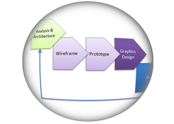
Talented graphics designers are an important part of the Product Design process. However, the process of Product Design is subverted when graphics or UI design or even UX Research are mistaken for BEING user experience design.
Good visual design communicates ideas and information effectively. While I like visual design as full stack Product Design Leader, I have more passion for user motivations and results than pixels. Marketing looks for product opportunities. Business managers set goals. Product architect/designers research and analyse to determine the who, what, where, when and why that align with those goals. Visual designers make everything look good. Developers build it to work for real. UX pros use data to improve the design to improve results. Take the UX part out and you’re left with guesswork.
Focusing on pretty design can ruin actual usability. A usable design that is unattractive isn’t that great, but a pretty design that isn’t usable is a FAIL. Users often *report* that pretty designs seem to be usable, even when those designs actually fail miserably. That’s why we don’t just ask for opinions. If you care about results, you test metrics, not opinions. In business, what works is what wins.
Product Design starts with knowing what you don’t know
A key part of my job is knowing what I don’t know. When I start working with a client, I don’t know what their goals are, I don’t know who their users are and I don’t know what those users need or why. I often find that the client thinks they know these things. If they are based on assumptions, I go about validating the things ‘we think we know’. Many companies have a UX department where graphics designers turn a functional spec into something pretty and “UX developers” build it. UX without user research and data-driven analysis isn’t UX by the agreed-upon standards.
When anyone thinks ‘I already know what users want’ or ‘I know how to make it usable’ without research, UX is being dismissed as something *everybody* does as part of their job. These ideas lead to a) bad design or b) disaster design. Disaster is where you think a design is good because management or focus groups like it when, in fact, it isn’t very usable.
Good Experience is about Results, not Sizzle
Unless it’s a game where pop and sizzle IS the deliverable, overstyling is the enemy of usability. All interfaces should look good, but too much wow will distract users from getting tasks done. The world has moved away from over-styled skeumorphism to flatter design for this reason. If I’m actually trying to do something (like purchase headphones or book a trip), help me do what I want to do, show me my options, let me know where I am and just get the job done. The user not only doesn’t want to see how cute and clever you can design everything, they will subconsciously hate you for trying to take them off task.
Clean design is always important, but
overstyling distracts from usability.
A lot gets missed when going straight from functional spec to graphics design. User research and wire-framing get tossed out as pointless “old school” time-wasters instead of essential steps. A great interface does not scream ‘look at how pretty I am’. The subconscious messages behind good design are: ‘this task is easy‘, ‘you are smart because you understand it‘, ‘you can focus on what you actually want to do‘. If you do it right, users KNOW they like it, but don’t have to think about why. The idea that “tons of features + pretty interface = massive success” doesn’t work.
“However beautiful the strategy, you should occasionally look at the results.” Winston Churchill
Evidence is Important
Experienced people sometimes have good intuition, but we still need evidence to back it up. Everyone has personal opinions. Evidence based on real users is better than anyone’s opinion. I have made all these errors myself. I have been the product manager who stumbled by proceeding from unproven assumptions. I have over-designed style over usability. My career has been the incremental improvement and trust in the process.
Repeat after me: I am NOT the target market.
Guesses don’t mean much. I never express an opinion about an interface without inquiring “who is this for, and what needs are it filling?”.
User Experience is a Process
You can develop anything without using the UX process. You can make assumptions, take shortcuts or skip it completely. The only good reason to do Product Design properly is if you care about results. UX replaces guesswork with a solid data-driven model for success. Better results means more conversions, more viral growth, stronger customer retention. A sound model for success benefits everyone in your team from the CEO on down.
If you like this article, share it.
If you’re interested in my work, check out my Portfolio & Case Studies.
Contact me if you’d like to discuss Design Leadership
Also published on Medium.


Im thankful for the post. Great. cekadccfeeebffdd
You are most welcome. Thanks for the comment!